Roles: served as creative director for the name, identity, branding, marketing and environmental design of an inaugural national conference.
In 2016, Bend the Arc brought together more than 500 supporters, leaders, donors, and allies from across the country. In the year leading up to the conference, I supervised all communications aspects of producing and marketing the conference and also played a key role in the development of the program — always with a consistent focus on the experience and needs of attendees. The conference was an incredibly powerful event for those present, helped to re-position the organization on the national stage, and led to national press stories.
Roles: creative direction, production, digital strategy
When the tone of the 2016 presidential campaign began turning south, Bend the Arc: A Jewish Partnership for Justice had the opportunity to make a powerful statement against the harsh anti-immigrant rhetoric of candidates. I helped create the concept and led the client-side of production, resulting in a moving and emotional ad.
The broadcast ad was paired with a digital strategy, including a paid list acquisition effort and targeted social media advertisements.
Roles: campaign strategy, creative direction, production
To commemorate the 50th anniversary of the deaths of three civil rights activists in 1964, I designed a candlelight vigil at the Lincoln Memorial, managed all the logistics, and worked closely with a videographer to capture the event.
Roles: concept, strategy, architecture, creative direction, some coding
In 2013 to launch an issue campaign in support of comprehensive immigration reform I conceived and created a microsite where visitors can take a quiz to find out if their ancestors would have been able to migrate under today's stricter immigration laws. The site surpassed all initial goals, spreading organically on social media (and thanks to tweets by people like E.J. Dionne and Mark Bittman), got picked up by MSNBC and the Daily Mail, with more than 40,000 visitors completing the quiz.
You can view the site at entrydenied.org.
Roles: design, writing, coding
At the end of the year, everyone's email inboxes fill up quickly with similar pleas for donations from non profits. This email was one of several conceived to be more unique and more visual than most fundraising emails, and employed seamless personalization in the design to make supporters feel part of a growing and impactful movement.
The email series this was a part of raised 240% more in online donations than the email series from the previous year. Feedback was also positive from external partners.
Roles: strategy, brand development, art direction
When Progressive Jewish Alliance (PJA) and Jewish Funds for Justice (JFSJ) merged, they combined a motley assortment of visual identities representing programs housed within the organization. The resulting mix reflected the ad hoc nature of brand management at both organizations, and contributed to a sense of confusion among donors and participants.
The need to rebrand with a new name created an opportunity to solve this problem. I worked with the CEO and program managers to earn buy-in for a cohesive, strong and clear visual identity system that is scalable, accommodating new programs as the organization grows. I then collaborated with our graphic designer to create this new system.
These before and after maps reflect the process of developing a meaningful and consistent brand for a multi-city, multi-program organization.
Roles: concept, photo-illustration, design
I created this poster for the holiday of Passover, providing supporters with a resource to relate the experience of living in a food desert to the story told at the Seder table. Posters were distributed at a Passover event at the USDA and earned media attention and a tweet by author Michael Pollan.
Roles: identity design, website development, collateral design
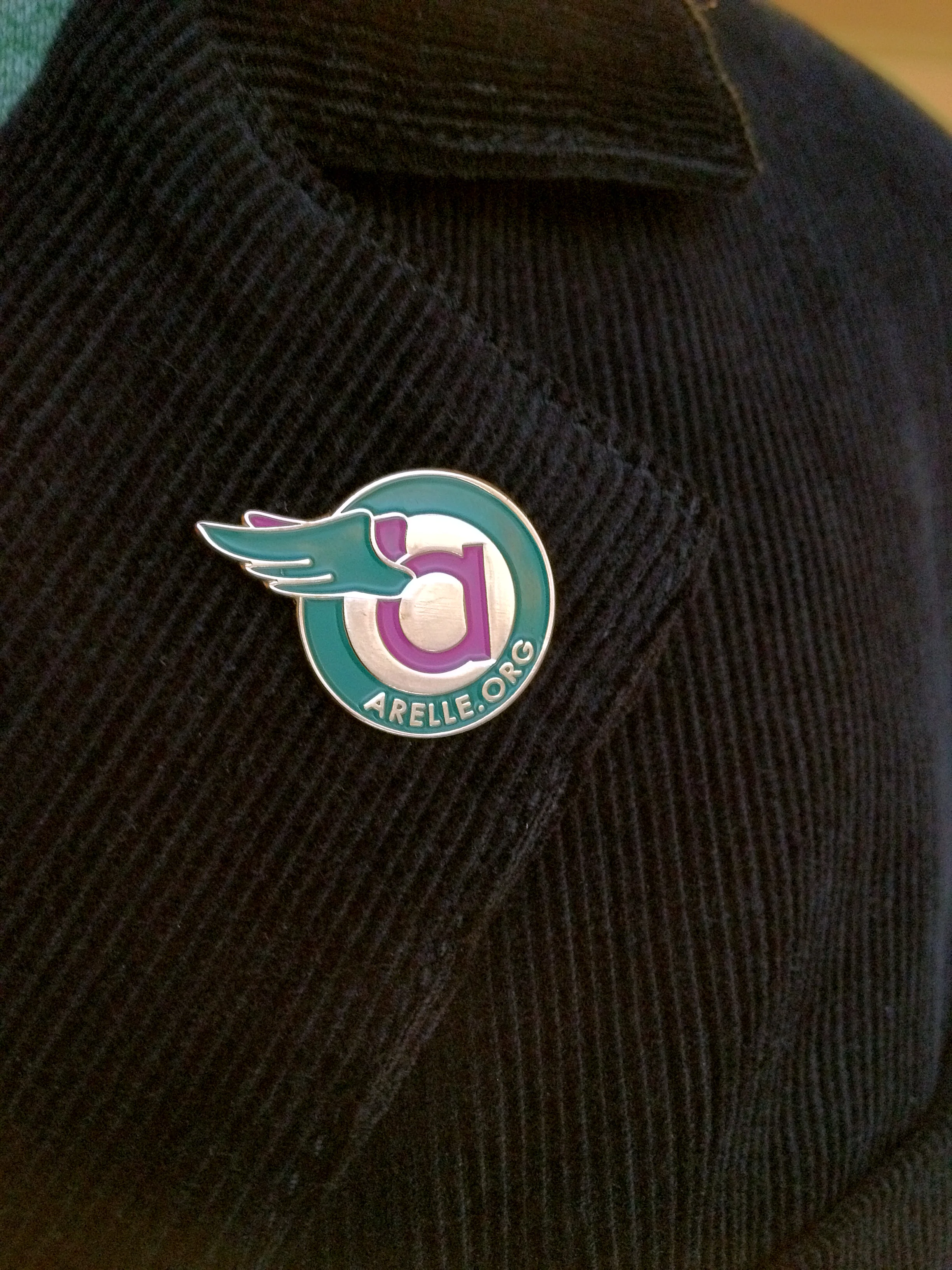
Arelle is an open source financial reporting software created in 2010. I created a visual identity and built its website to launch the project.
The name is derived from the pronunciation of its language (XBRL, or Ecksbee Arelle), and means 'messenger from God.'
The wings are modelled on ancient vase paintings of Greek messenger gods, emphasizing the reporting (or messenger) function of Arelle. Simple geometric letterforms of the custom typeface communicate transparency and honesty.
Roles: strategy, photo-illustration, design, print production, web production
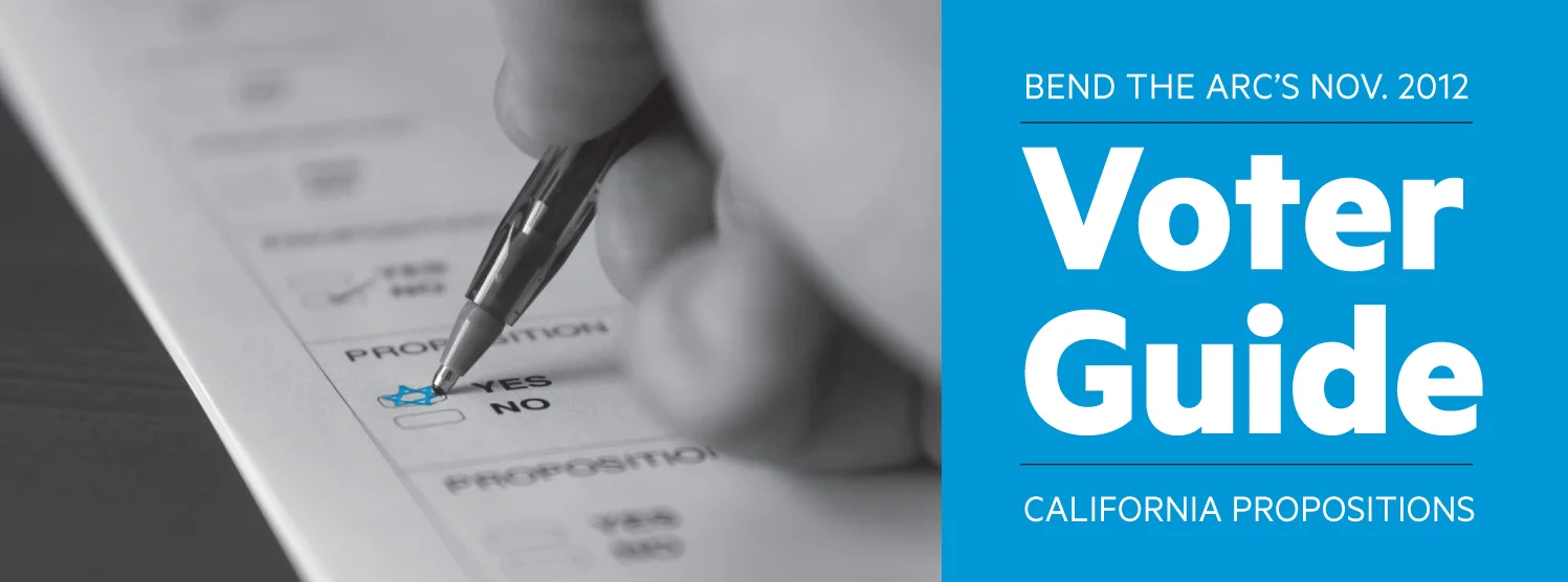
Since 2005, Bend the Arc and its predecessor has been producing annual voter guides as downloadable PDFs. In 2012 I envisioned the first-ever printed distribution strategy and contributed the graphic design. The 2012 voter guide was mailed to supporters as a postcard, printed as a booklet for distribution, posted online, and shared on social media, all in an effort to increase voter education and engagement.
Feedback from supporters was effusive and grateful, and the multi-channel distribution process allowed engaged supporters to share the guide with their friends and family, led to a spike of traffic on the website and hundreds of new supporters were added to Bend the Arc's list when they downloaded a printable PDF from the website.
Selections from my final roll of Kodachrome, developed in the last days before the film stock was discontinued.
Taken in Death Valley National Park.